Table of Contents
In the fiercely competitive fast-moving consumer goods industry, outer packaging has always been a battleground for major brands to attract consumers. With the maturation of the consumer market, the importance of "appearance" in people's purchase decisions is increasing. Consumers are becoming more and more picky about product packaging, so they are very willing to pay immediately for a beautiful package.
What do food packaging designs that have won international awards look like? What makes them special? Let's take a look together~
01.Srisangdao organic rice
This packaging is designed using rice husks, which are natural waste from the hulling process. The packaging is made through molding, with a rice grain embossing on the top of the box cover, graphic lines of rice fields and rice spikes, and a logo with some details stamped on it. The box is also filled with rice bags printed with batch numbers and rice data.
The most creative part is that after the rice is eaten, the complete rice box can be turned upside down and used as a tissue box, which perfectly embodies the concept of "environmental protection".


02.Kasemrad vitamin mineral water
KASEMRAD is the only brand that adds natural inherent vitamins during the production process, and its packaging is inspired by real spring water, hence the bottle shape with stream ripple design, evoking the natural flavors of its place of origin.
In addition, the label selection is mainly in white, symbolizing the purity of Vitamin Mineral Water. The term "VMW" is also designed in a wave-like pattern to complement the structure of DNA molecules. Additionally, the graphics on the side of the label also convey the connection between water and vitamin molecules.


03.Milgrad Milk
Many designers should know the milk carton design from Russia, using blue as the main color, with the capital letter "M" combined with a cat, associating "M" with cat ears, and then designing a new version of the brand logo to create the recognizable image of the "Blue Cat" element.
What's even more interesting is that by just turning the direction of the packaging box, you will find that when "four bottles" of milk are placed together, they form a complete blue cat. This display method on the shelf makes it easy for consumers to not resist buying all of them home.


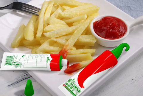
04.Farmer's Sky Hot Chili Sauce
The philosophy of the skyward farmers is the natural cultivation without the need for manual intervention. They respect natural laws and avoid any additives. The creative idea for this packaging combines the shape of chili peppers with the container, allowing customers to feel that the chili sauce inside is just like freshly picked by hand.
Three colors distinguish different types of chili sauce, with packaging tubes and lids made entirely from corn starch materials that can fully degrade in natural composting conditions within 6 months. From product to packaging, the natural and environmentally friendly concept is maintained.


Comments (0)
There are no comments for this article. Be the first one to leave a message!